The Bar chart is a horizontal bar graph that visualizes categorical data in a rectangular bar with the width proportional to the value.
In a Bar Chart, the x-axis represents the aggregation parameter and the y-axis represents the grouping parameter(s). Besides this, it is similar to the Column Chart.
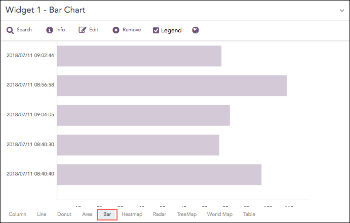
Count of logs grouped by time stamp.
The following query gives the output shown above.
| chart count() by col_ts limit 5
The Bar chart supports a single aggregation response types for representation of search results in the visualization. It is :
Response Type |
General Syntax |
|---|---|
| chart aggregation_parameter by grouping_parameter1, grouping_parameter2, ........, grouping_parametern
|
Example:
severity=* | chart count() by severity order by count() desc limit 5
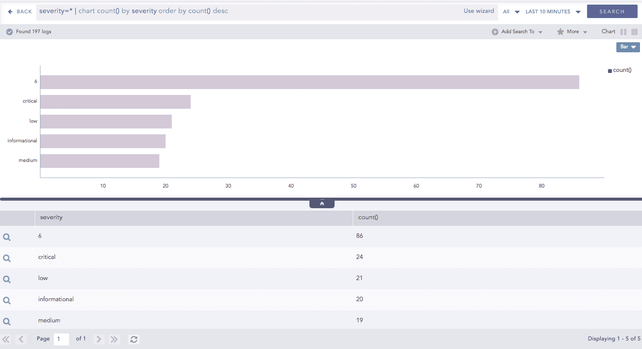
Bar chart for Single Aggregation with Grouping
You can refer to Single Aggregation with Grouping for more details.